Style 和 Theme 在初学Android都是被各种视频一笔带过,对其理解就是style可以类似html的css 可以继承,可以各种地方直接引用做到直接管控,而theme更是一笔带过,然而当我学到了一个android 国外的style 和 Theme课程才发现,一切并非如此……
Android Theme目前的应用情况
一般情况下,我了解到的和平常搜索到的应用场景,一般情况都以处理window的标题栏和背景透明一类的内容,但我经过学习探究后才发现,我们对于这类的基础知识过于的不重视,其实Theme配合style可以做到很好的管控我们UI,做到皮肤切换,日夜间模式
Android Theme配合Style解决的问题 (WHY)
-
将默认的view样式修改为UI图中一些通用样式的样板代码,耗费时间却没有任何的技术含量,以前也会尝试使用style或者自定义组件去解决这样的问题,但这并不是最恰当的实现,后问笔者会阐述使用这种方式遇到的问题
-
在笔者公司UI资源紧张的情况,无法为所有app提供样式设计;内部应用直接由开发自己处理UI样式,导致app样式都比较混乱
-
在以前笔者没有重视style和Theme的配合使用,单单使用style管控UI元素,在app想实现日间模式,夜间模式,切换皮肤 等功能,变的异常困难。
Android Theme 和 Style (WHAT)
首先,我们来重新看一下官方定义的概念:
style官方原文:
A style is a collection of attributes that specify the appearance for a single View. A style can specify attributes such as font color, font size, background color, and much more.
笔者渣翻译:
style 是一个特定样式view的属性的集合。一个style可以定义 比如 字体 颜色尺寸 背景等等特定属性
Theme官方原文
A theme is a type of style that’s applied to an entire app, activity, or view hierarchy, not just an individual view. When you apply your style as a theme, every view in the app or activity applies each style attribute that it supports. Themes can also apply styles to non-view elements, such as the status bar and window background.
笔者渣翻译:
Theme 是一种应用于整个application,activity或view 整个继承结构的样式,而不仅仅是用于单个view。当你将style应用为Theme时,application或activity中的每一个view 都会应用它支持的每个style的属性。Theme还可以将style应用于非视图元素,例如status bar 和背景。
而我认为也是被很多人忽略的一个非常强大功能 —— 拓展并且自定义样式 官方原文:
When creating your own styles, you should always extend an existing style from the framework or support library so that you maintain compatibility with platform UI styles. To extend a style, specify the style you want to extend with the parent attribute. You can then override the inherited style attributes and add new ones.
即我们可以在theme中,直接定义我们所有view组件的默认样式,这对于我们的控件的样式提供了巨大的便利,且无需像style的定义那样,需要我们去书写备注,或者文档去说明去方便他人在多人开发中使用
实际使用展示(HOW)
针对app的Theme重写
<resources>

    <!-- Base application theme.设定我们的基础theme -->
    <style name="AppTheme" parent="@style/Theme.AppCompat.Light.NoActionBar">
        <!--
         此处定义大于minSdk的所有android版本可以适用Theme
        方便可以只需要写一份,统一管控
         -->
        <item name="colorPrimary">@color/colorPrimary</item>
        <item name="colorPrimaryDark">@color/colorPrimaryDark</item>
        <item name="colorAccent">@color/colorAccent</item>
    </style>

    <style name="EhiAppTheme" parent="AppTheme">
    <!--
        此处,继承appTheme定义不同sdk版本下添加的新Theme特性,添加到不同的value下面的style中,管控不同版本下的特性
    -->
        <!--重写style的默认样式-->
        <item name="buttonStyle">@style/ehiButton</item>
        <item name="android:checkboxStyle">@style/ehiCheckBox</item>

    </style>
     <!-- 部分代码忽略 -->
    <style name="ehiButton" parent="@style/Base.Widget.AppCompat.Button">
        <item name="android:background">@color/colorAccent</item>
        <item name="android:textColor">@color/white</item>
        <item name="android:textAppearance">@style/Base.TextAppearance.AppCompat.Small</item>
    </style>
    <style name="ehiCheckBox" parent="@style/Base.Widget.AppCompat.CompoundButton.CheckBox">
        <item name="android:background">@color/colorPrimaryDark</item>
        <item name="android:textColor">@color/white</item>
        <item name="android:textAppearance">@style/Base.TextAppearance.AppCompat.Display1</item>
        <item name="android:checked">true</item>
    </style>

</resources>
使用该Theme
  <application
        android:allowBackup="true"
        android:icon="@mipmap/ic_launcher"
        android:label="@string/app_name"
        android:roundIcon="@mipmap/ic_launcher_round"
        android:supportsRtl="true"
        android:theme="@style/EhiAppTheme"><!--引用定义的style-->

      <!--部分代码省略-->
    </application>
此时当我们再次编辑我们的layout文件时:
<LinearLayout xmlns:android="http://schemas.android.com/apk/res/android"
    xmlns:tools="http://schemas.android.com/tools"
    android:layout_width="match_parent"
    android:layout_height="match_parent"
    android:orientation="vertical"
    tools:context=".MDActivity">

    <Button
        android:id="@+id/btn"
        android:layout_width="match_parent"
        android:layout_height="wrap_content"
        android:text="测试按钮" />


    <CheckBox
        android:layout_width="match_parent"
        android:layout_height="wrap_content"
        android:text="测试复选框" />

    <RadioGroup
        android:layout_width="match_parent"
        android:layout_height="wrap_content"
        android:orientation="horizontal">

        <RadioButton
            android:layout_width="wrap_content"
            android:layout_height="wrap_content"
            android:text="测试1" />

        <RadioButton
            android:layout_width="wrap_content"
            android:layout_height="wrap_content"
            android:text="测试1" />
    </RadioGroup>

</LinearLayout>
使用效果展示
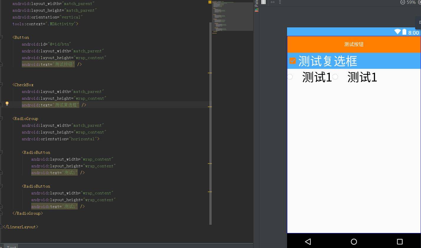
可以看的出我们的布局文件只填写了,最基本的宽高和文本信息,还没有引入任何的style,便直接可以呈现此时一个默认的状态,减少了样板代码的同时,在多人开发中,其他人无需关心按钮的你是否定义过相关样式,也无需自己再重新定义,因为Theme使得许多view的样式变成了“所见即所得”状态!
而产生这样的一个效果的最关键的代码,在于Theme:
    <item name="buttonStyle">@style/ehiButton</item>
    <item name="android:checkboxStyle">@style/ehiCheckBox</item>
这行代码在我们的Theme中覆盖了android默认提供的按钮样式,使得我们的按钮可以默认展示我们想要的通用的模板样式!并且android其实每一个控件都有对应的 xxxStyle可以提供我们去重写自定义,所以其对我们提供的拓展性不言而喻!
再回到刚才提出的问题:
1.将默认的view样式修改为指定样式的样板代码,耗费时间却没有任何的技术含量…..
答:
此时,第一个问题已经,直接在用法示例中得到回答,这种是笔者认为最不需要学习成本的定义通用UI的用法,而且定义style或者定义自定义控件其他人都有很多的学习成本,而theme中定义完全不存在这样的问题,用法和平常是完全一致的!
2.在笔者公司UI资源紧张的情况,无法为所有app提供样式设计…… ``` 答 在有了第一个基础上,我们就可以定义一套基础组件的样式皮肤,用于没有UI的android的项目,这对于我们的个人开发项目同样是一个福利,可以直接仿制或者引用他人的一套theme
>3.在以前笔者没有重视style和Theme的配合使用,单单使用style管控UI元素,在app想实现日间模式,夜间模式,切换皮肤 等功能,变的异常困难。
答: 这个只需要在前面的基础上,添加多套Theme利用java代码进行切换即可!
## 原理解析

上文我们看到android的theme是非常强大的,随意覆盖重写一个 ImageViewStyle,又或者是ButtonViewStyle,就可以有我们自己的一个通用样式模板,那么到底Android是怎样做到的呢?又或者说我们是否可以有自己的控件库也用同样的方式使用呢?

 答案是当然可以的!

那么我们就来学习一下Android本身是如何定义这个系统控件的,首先我们要快速回顾一下自定义控件的一些基础知识

### View国内通常写法

#### 快速了解构造函数用途
1. **view(Context)** 代码创建
2. **view(Context,AttributeSet)** 用于在xml里面构建
3. **view(Context,AttributeSet,defStyleAttr)*用于读取系统theme
第四个只有使用到minSDK == 21才可以使用,所以暂时忽略

#### 快速参数讲解
* context 上下文
* AttributSet XML渲染使用的属性
* int defStyleAttr 默认的style应用到view上(定义于 theme)
* int defStyleResource 用于直接引用一个style资源应用到view上,(if defStyleAttr is unused.需要验证)
 //除去上下文,都用于初始化view相关属性

#### Attributes 属性
以ImageView为例(较常用不细讲)
```xml
 <ImageView
        android:id="@+id/title_template"
        android:layout_width="match_parent"
        android:layout_height="wrap_content"
        android:gravity="center_vertical|start|left"
        android:orientation="horizontal"
        android:paddingLeft="?attr/dialogPreferredPadding"
        android:paddingRight="?attr/dialogPreferredPadding"
        android:paddingTop="@dimen/abc_dialog_padding_top_material"/>
自定义View的写法
同样以大家熟悉的 imageView为例
1.一般都是先定义attr 的
<declare-styleable name="ImageView">
  <!-- Sets a drawable as the content of this ImageView. -->
  <attr name="background" format="reference|color" />
  <attr name="src" format="reference" />
  <!-- ...snipped for brevity... -->

</declare-styleable>
2.然后就是覆盖构造方法,由于我们的写法第一和第二个构造方法都是引用第三个构造方法 这里就简单展示一下第三个
public ImageView(Context context, AttributeSet attrs,defStyleAttr) {
  TypedArray ta = context.obtainStyledAttributes(attrs, R.styleable.ImageView);
  Drawable src = ta.getDrawable(R.styleable.ImageView_src);
  setImageDrawable(src);
  ta.recycle();
}
如果我们写ImageView一般都会按照上文套路来写,但是其实android本身并非是这种写法!
系统控件写法
1.定义attr部分的系统控件做法
<resources>

    <!-- ...snip... -->

    <attr name="ImageViewStyle" format="reference" />
     <declare-styleable name="ImageView">
        <!-- Sets a drawable as the content of this ImageView. -->
        <attr name="background" format="reference|color" />
        <attr name="src" format="reference" />
        <!-- ...snipped for brevity... -->
    </declare-styleable>
    <!-- ...etc... -->

</resource>
请注意,系统会直接定义这样的一个style的attr属性
<attr name="ImageViewStyle" format="reference" />
这个就是我们能够theme中引用并覆盖样式的定义处
- @style/MyTheme.ImageView
仅仅定义了当然是远远不够的,接下来得一点区别是包括我在内的很多人都忽略的!
在android中真实定义view时,并非我们那么简单,在第二个构造函数就有了不同的设置
class ImageView{
    public ImageView(Context context) {
        this(context, null);
    }
    public ImageView(Context context, AttributeSet attrs) {
        this(context, attrs, com.android.internal.R.attr.ImageViewStyle);
    }
}
请注意
this(context, attrs, com.android.internal.R.attr.ImageViewStyle);
这一行,就是我们在平常自定义控件所不熟知的引用读取theme给定义的默认样式真正方式!也是因为这一行我们可以在切换theme时,有完全不相同表现风格!
而第三个构造函数,也和我们的写法不同
  public TextView(Context context, @Nullable AttributeSet attrs, int defStyleAttr){
 final TypedArray a = context.obtainStyledAttributes(
                attrs, R.styleable.ImageView, defStyleAttr, 0);

      }
它们会将由第二个构造函数传入的 com.android.internal.R.attr.ImageViewStyle 直接通过defStyleAttr加载进去成为我们的自定义属性新的默认值!
故我们在上文中所提及的
<item name="buttonStyle">@style/ehiButton</item>
使用覆盖theme的style定义自己样式,其实就是通过这样的方式被android所读取到,由此提供到我们想要的默认样式!并且android在每个系统更新后变更自己UI的默认风格其实就是通过系统默认的内置一套theme的属性进行调整达到不改代码变化系统UI的效果!
我认为这就是好的设计!将变化的部分抽离出去配置化,在不改变代码的情况下,达到我们想要的UI效果!
场景
一般我们在定义自定义组件时都忽略这一点,就是默认样式;我们在项目工程中很多时候都会自定义组件,但是很多时候,我们的自定义组件只能唯自己使用;这也是项目形成组件库的一个拦路虎!
如果,我们可以使用这样的类似系统的思路,定义由默认样式,有以下好处
- 样式定义后,其他人在工程中使用,所见即所得可以直接看到效果
- 使用时,同一个项目大量使用该组件,在theme中定义好默认样式,可以节省大量的代码
- 跨工程使用,可以在theme直接替换自己的样式,达到相同效果